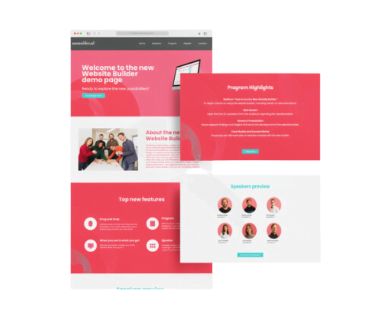
10 must haves for your event website
The website is the business card of your event. It deserves just as much attention as the event itself. We give you 10 must haves that every event website should have. With these tips and tricks you will have a successful and user friendly website.
1. A website is readable
This might seem obvious, but unfortunately we still see websites with unreadable content. By using enough spacing, enumerations, headings and colour makes a website easy to read.
- Use 1 Head (h1) and several subheads (h2 of h3).
- A paragraph is max 8 sentences long.
- Use enumerations like these.
- Place hyperlinks as little as possible.
- Use bold words moderately.
- Keep the sentences short.
2. Responsive
Responsive means that the website is accessible and readable on every device. De chances are that your target audience will visit the website with their phone. That’s why it’s important that the website for mobile is just as user friendly and attractive as the desktop version. You can use this tool to find out whether your website is mobile friendly.
3. CTA
In other words: Call To Action buttons. A CTA shows which action is desired from the visitor. On the one hand it’s steering, on the other hands it’s predictable. Try to use at least one CTA on every webpage. Try to use a colour for the CTA that stands out on your website The text in the CTA is short and enables a clear action.
Do you want to use more than one CTA? Try to use a different design for all CTA. The most important action stands out the most, the other has a more subtle look.
4. Communicate effectively
Make sure that your visitors see the following information on your event website: whom is your event for? When is your event? Where is your event? Appeal to your audience, if you don’t, you will lose your visitors.
5. Use strong images
Use images that tell the story of your event. A banner on the top of the page is one of the favorites. You can also place text and a CTA in these banners. But you can also use images on other places on the website. Have you hosted an event before? Then use these images to set up a slideshow.
6. Video is even more powerful
Video’s tell more than images. Use video in the content to make a real impression. Preferably a video of a previous event, but other promotional material also does the trick.
7. Easy navigation
Make sure you have a clear navigation on your website. Use a structure to make the path for users easy accessible. Does your registration process have more than one step? Use correct CTA’s to amplify that and tell your visitors which steps follow.
8. Make contacts visible
If there are any questions about the event or registration, the visitor probably wants to contact you. So make sure that contact information is visible on your website. At least one email address and phone number should be displayed on your website.
9. Make an appropriate design
Make an impression with a tight design. Integrate your corporate identity and use icons and images. Don’t overcrowd it. Monitor the usability and conversion optimization.
10. Get Google to instantly index your website
Index the website so search engines can find it. You will increase the reach of your event. Is it a private event? Then you might want to choose to not index your website.
Examples event website
With aanmelder.nl you can build your own event website in simple and easy steps. Do you need more inspiration? Check out our examples of event websites.
Or check out all the possibilities in our tool and start building your own website.
Hi there Event Manager… You got a moment?
Are you planning an event soon? With Event Management, you can automate and streamline various tasks, allowing you to focus on the event itself. Automate and personalize mailings, create an event website, register participants, sell tickets, manage financial administration, and much more.
Sign up for a free 14-day trial and discover how it works.
